
この記事では、Pythonで matplotlib を使って棒グラフを描画する方法を解説します。
棒グラフは、棒の高さでデータの大小を視覚的に捉えることが可能です。
基本的な matplotlib の使い方は以下の記事を参照してください。

それでは、棒グラフの使い方を見ていきましょう!
棒グラフを描画する
棒グラフを描画するには matplotlib.pyplot の bar() 関数を使います。
import matplotlib.pyplot as plt plt.bar(x, height, width=0.8, bottom=None, *, align='center', data=None, **kwargs)横軸の値 x と高さ height を渡すことで棒グラフを描画できます。
import matplotlib.pyplot as plt import numpy as np # x と 高さ の値 x = np.arange(1, 5) # [1 2 3 4] height = np.array([4, 2, 6, 3]) # [4 2 6 3] plt.bar(x, height) # 表示 plt.show()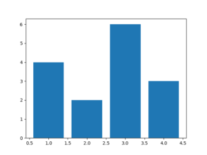
x には、文字列を指定することもできます。
import matplotlib.pyplot as plt import numpy as np # x と 高さ の値 labels = ['A', 'B', 'C', 'D'] height = np.array([4, 2, 6, 3]) # [4 2 6 3] plt.bar(labels, height) # 表示 plt.show()
複数の棒グラフ
棒グラフを複数描画するには以下のような方法があります。
積み上げ棒グラフ
積み上げグラフを描画するには bottom で片方のグラフの高さのぶんだけ下側に余白を挿入し、ずらして描画することで実現できます。
import matplotlib.pyplot as plt import numpy as np # x と 高さ の値 labels = ['A', 'B', 'C', 'D'] height1 = np.array([4, 2, 6, 3]) # [4 2 6 3] height2 = np.array([1, 5, 7, 8]) # [1 5 7 8] plt.bar(labels, height1) # bottom で height1 のぶんだけ下側に余白を描画 plt.bar(labels, height2, bottom=height1) # 表示 plt.show()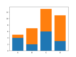
グループ化した棒グラフ
2つの棒グラフをグループとして表示させるには、棒グラフを2つ作成し、横にずらすことで実現できます。その際、棒グラフの横幅を width で狭くしておかないと被ってしまうので注意。
import matplotlib.pyplot as plt import numpy as np # 横軸の値 x = np.array([1, 2, 3, 4]) # 縦軸の値 height1 = np.array([4, 2, 6, 3]) height2 = np.array([1, 5, 7, 8]) # 棒グラフの幅 width = 0.3 # 横幅の分だけずらして作成 plt.bar(x - width/2, height1, width) plt.bar(x + width/2, height2, width) # 表示 plt.show()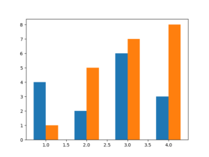
グループ化した棒グラフに名前を付けるには Axesインスタンス を生成し、set_xticks() を使うことで付けれます。
import matplotlib.pyplot as plt import numpy as np # Axesインスタンス の生成 ax = plt.axes() # ラベル labels = ['A', 'B', 'C', 'D'] # 横軸の値 x = np.arange(len(labels)) # 縦軸の値 height1 = np.array([4, 2, 6, 3]) height2 = np.array([1, 5, 7, 8]) # 棒グラフの幅 width = 0.3 # 横幅の分だけずらして作成 plt.bar(x - width/2, height1, width) plt.bar(x + width/2, height2, width) # x軸にラベルを描画 ax.set_xticks(x, labels) # 表示 plt.show()
凡例を表示
複数の棒グラフを表示する際は 凡例 があるとわかりやすくなります。凡例は、グラフにラベルを設定してlegend() を呼び出します。
import matplotlib.pyplot as plt import numpy as np labels = ['A', 'B', 'C', 'D'] height1 = np.array([4, 2, 6, 3]) height2 = np.array([1, 5, 7, 8]) # labelの設定 plt.bar(labels, height1, label='X') plt.bar(labels, height2, bottom=height1, label='Y') # legend() を呼び出す plt.legend() plt.show()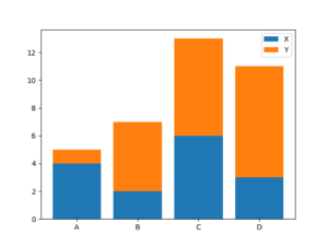
棒を加工する
matplotlib には、グラフを見やすくするために様々なオプションが用意されています。試しに簡単なグラフのオプションを変更してみて、どのようなものがあるか確認していきましょう!
ここでは以下のようなグラフを使います。
import matplotlib.pyplot as plt import numpy as np labels = ['A', 'B', 'C', 'D'] height = np.array([4, 2, 6, 3]) plt.bar(labels, height) plt.show()
棒の太さ
棒の太さを width で変更できます。
plt.bar(labels, height, width=0.95)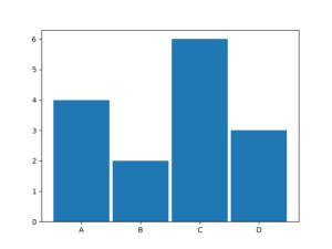
棒の色
棒の色を color で変更できます。
plt.bar(labels, height, color='red')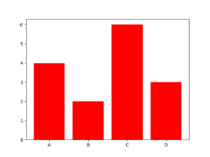
枠線のみの表示
fill に False を指定することで棒を塗りつぶさないで表示できる。
plt.bar(labels, height, fill=False)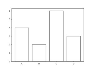
枠線の変更
枠線の太さや色を変更できる。
| linewidth | 枠線の幅 |
|---|---|
| edgecolor | 枠線の色 |
plt.bar(labels, height, linewidth=4, edgecolor='red')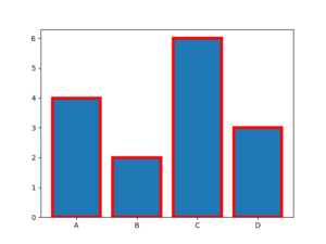
まとめ
この記事では、matplotlib を使って棒グラフを描画する方法を解説しました。
棒グラフを使うことでデータの大小を視覚的に捉えることが可能です。
それでは今回の内容はここまでです。ではまたどこかで〜( ・∀・)ノ